
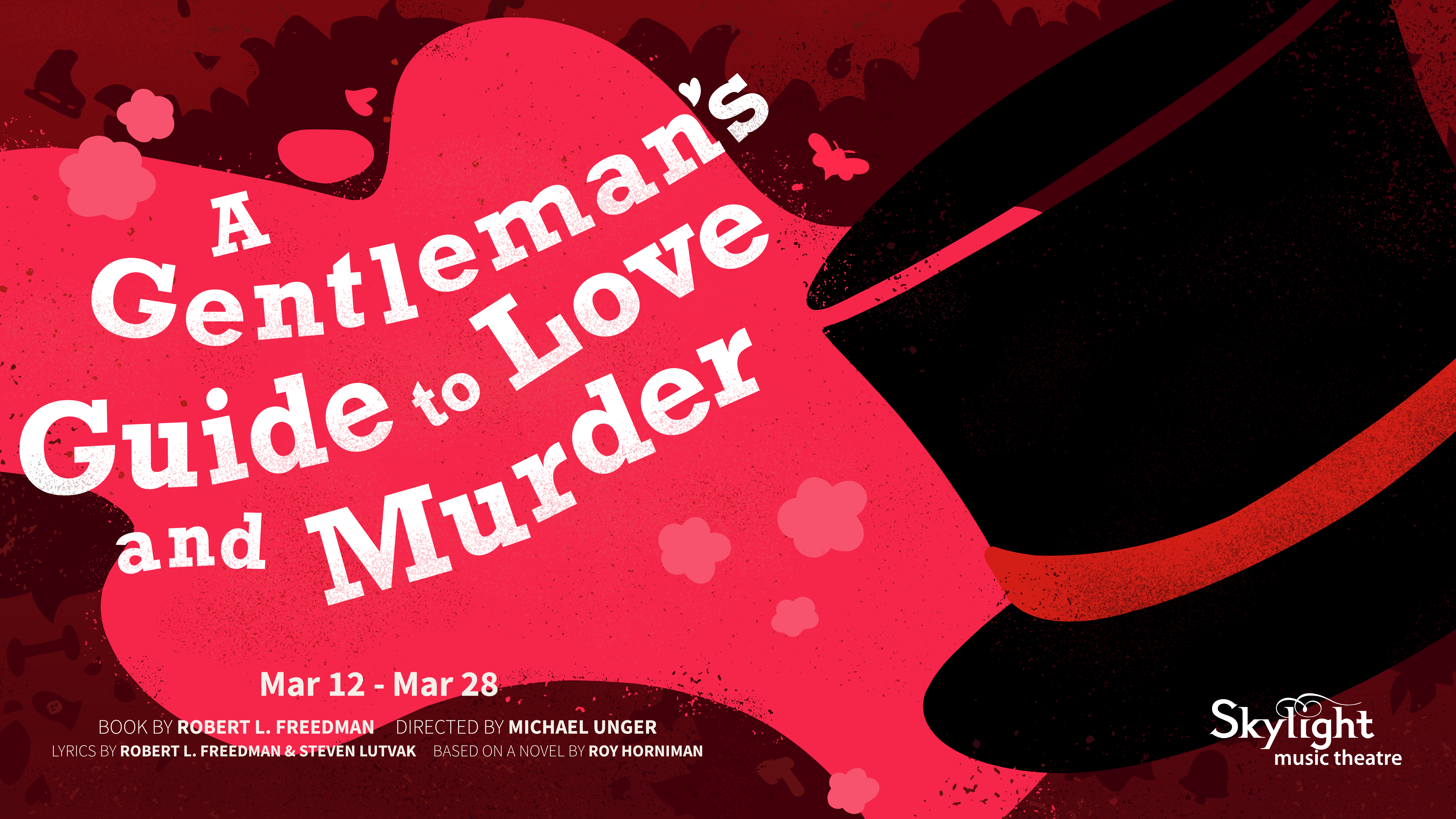
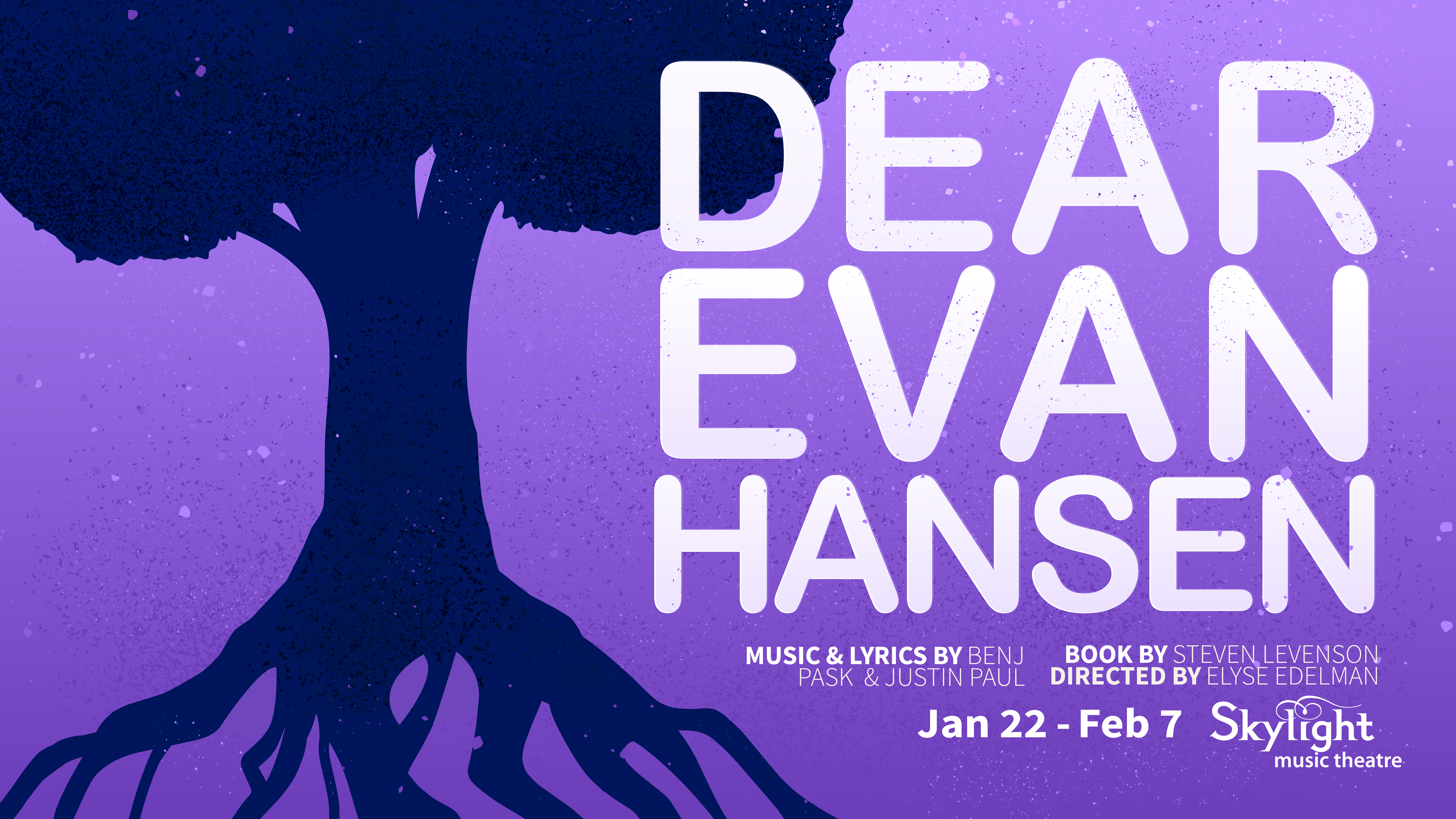
Skylight Theater was looking for designs to market their new shows.
They needed posters and merch that would express the bold nature of their shows, maintain a textured yet minimalist silohuette design, and incorporate white space. They also emphasized wanting the posters to match and be cohesive. Because another designer was working on other posters for the same season, we discussed our ideas for how to approach the project and worked out a plan for our stylistic approach.
I began planning the horizontal designs.
Before picking a direction for the posters, we chatted about Skylight's goals and examined a handful of examples they liked.
From there, I prioritized giving Skylight a variety of options to choose from. I watched recordings of the shows, read audience reviews,
and examined preexisting posters to understand the mood of the shows and the types of symbolic imagery I could incorporate.
I went back and forth with Skylight creating various sketches for them to choose from, incorporated their feedback, and sent over revised versions.
We completed a total of five rounds of revision, resulting in 29 different sketch options.
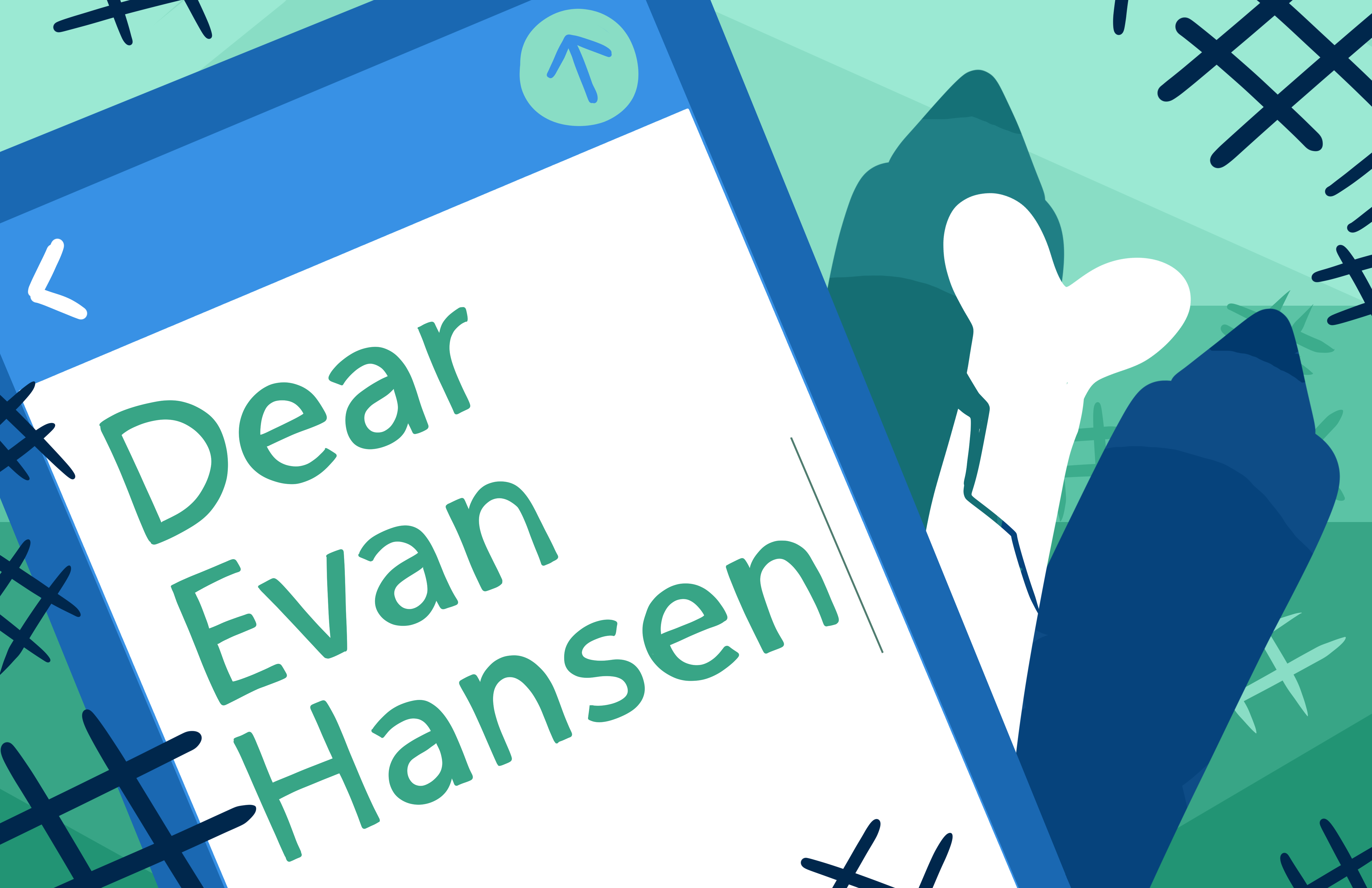
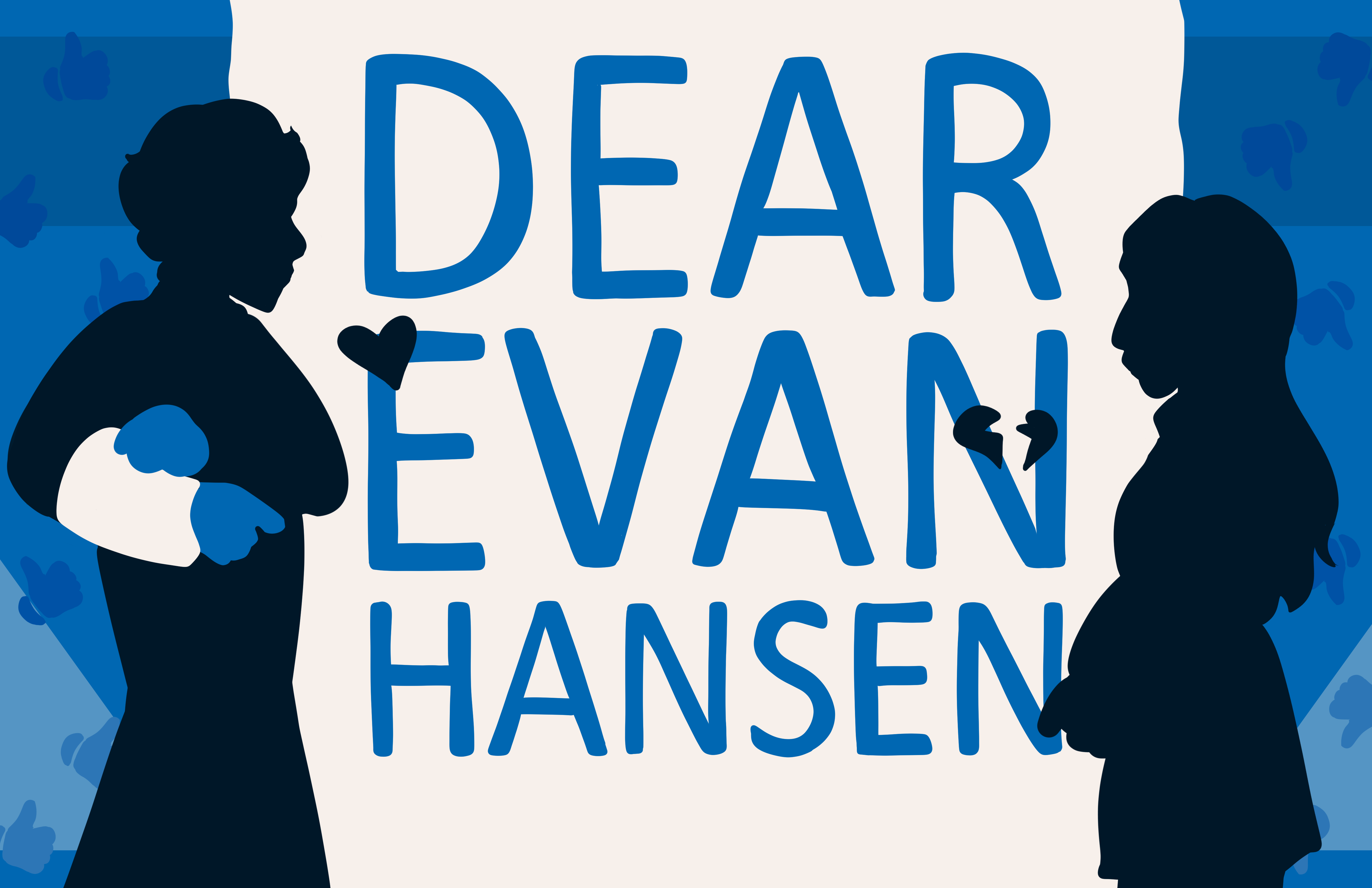
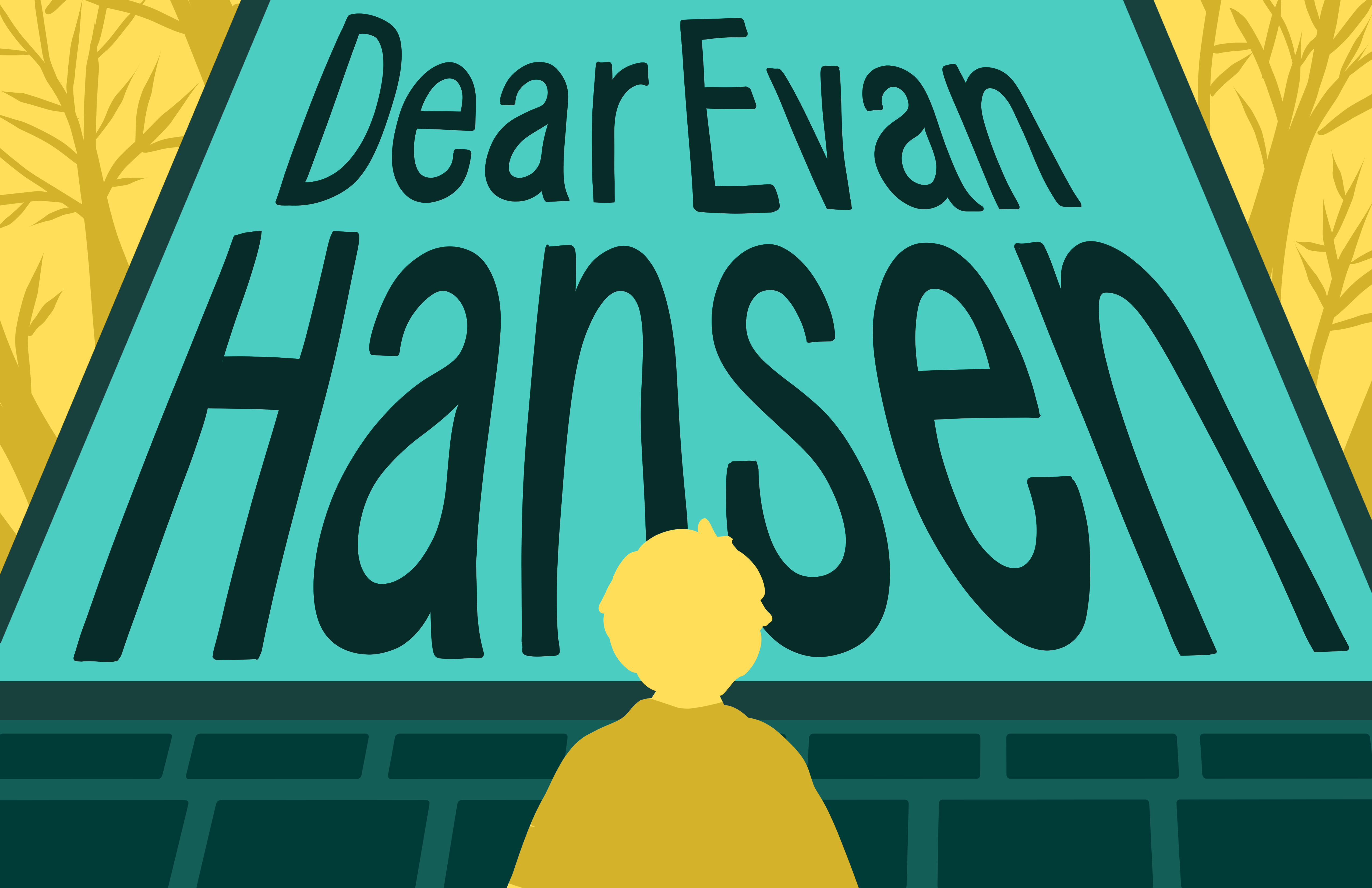
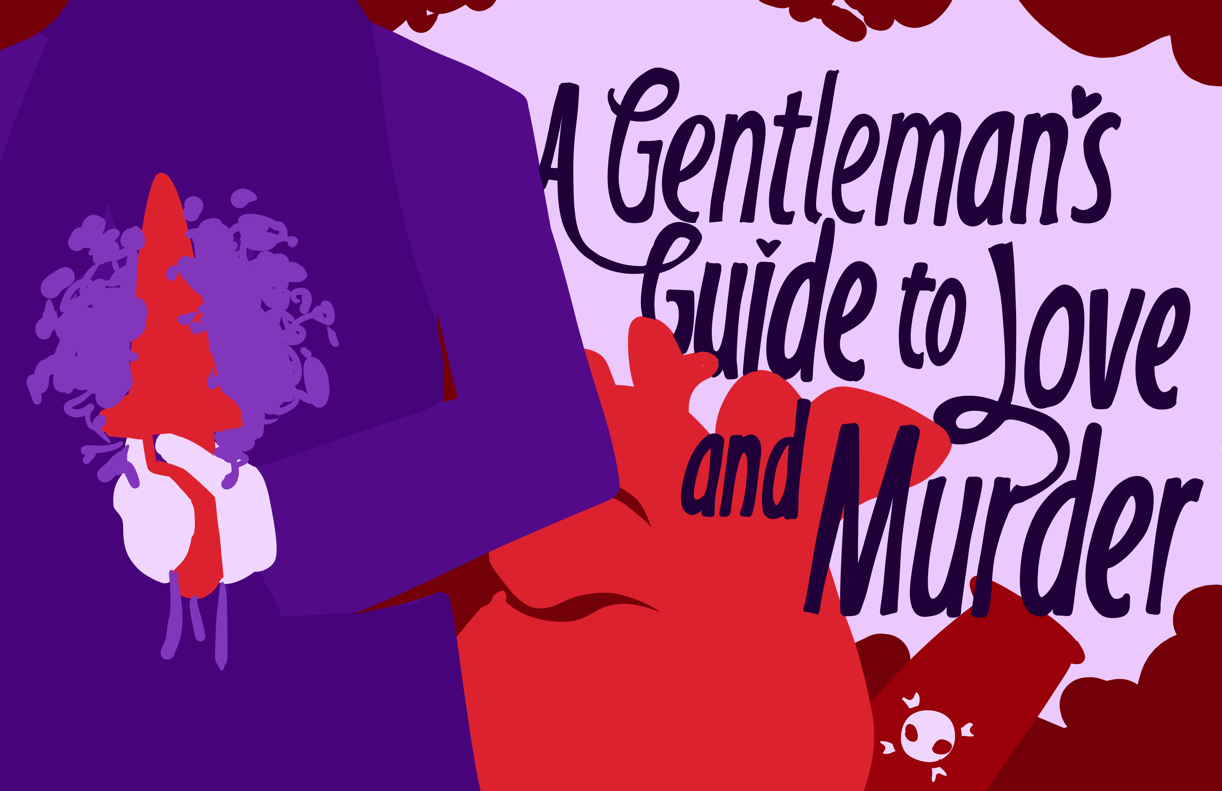
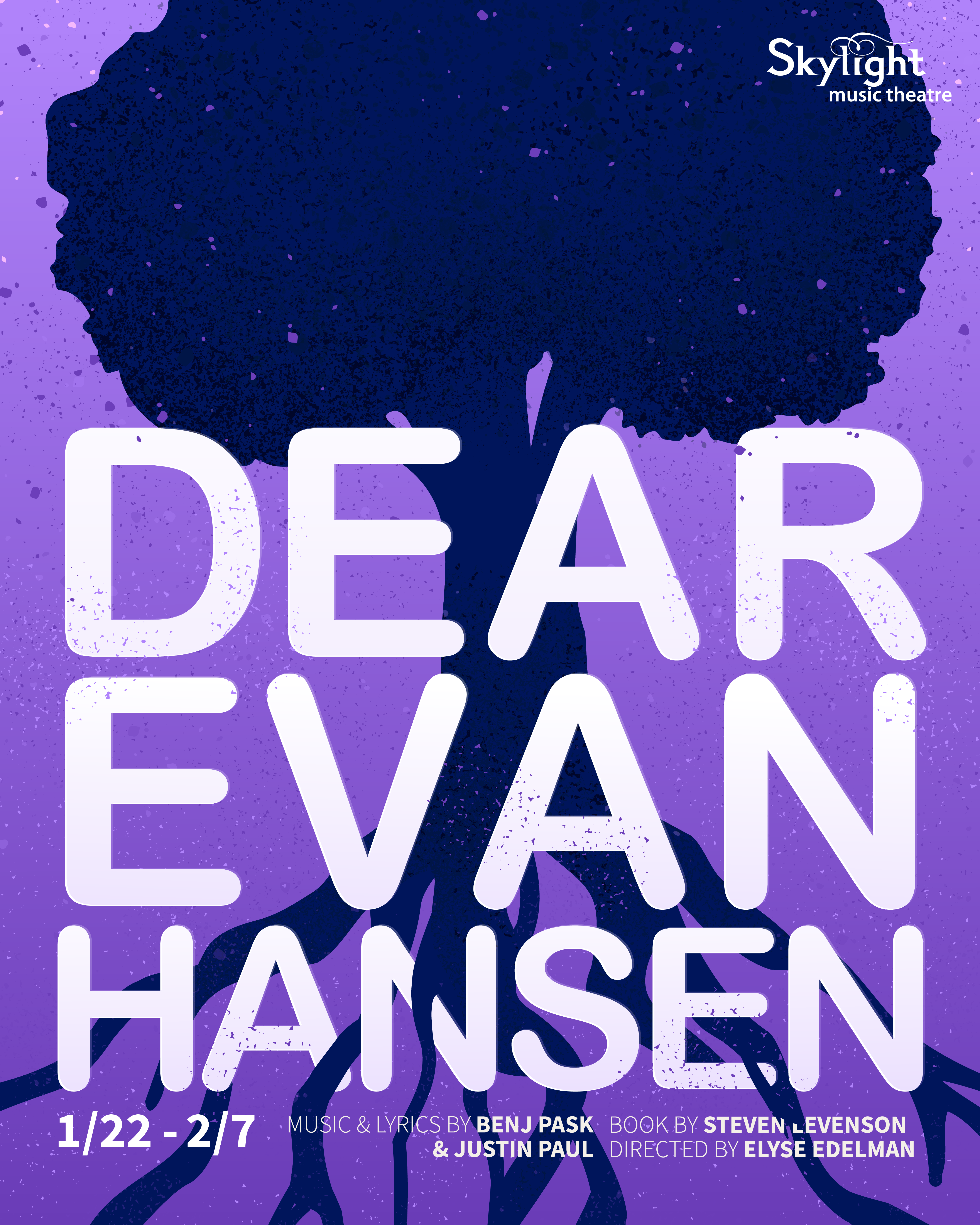
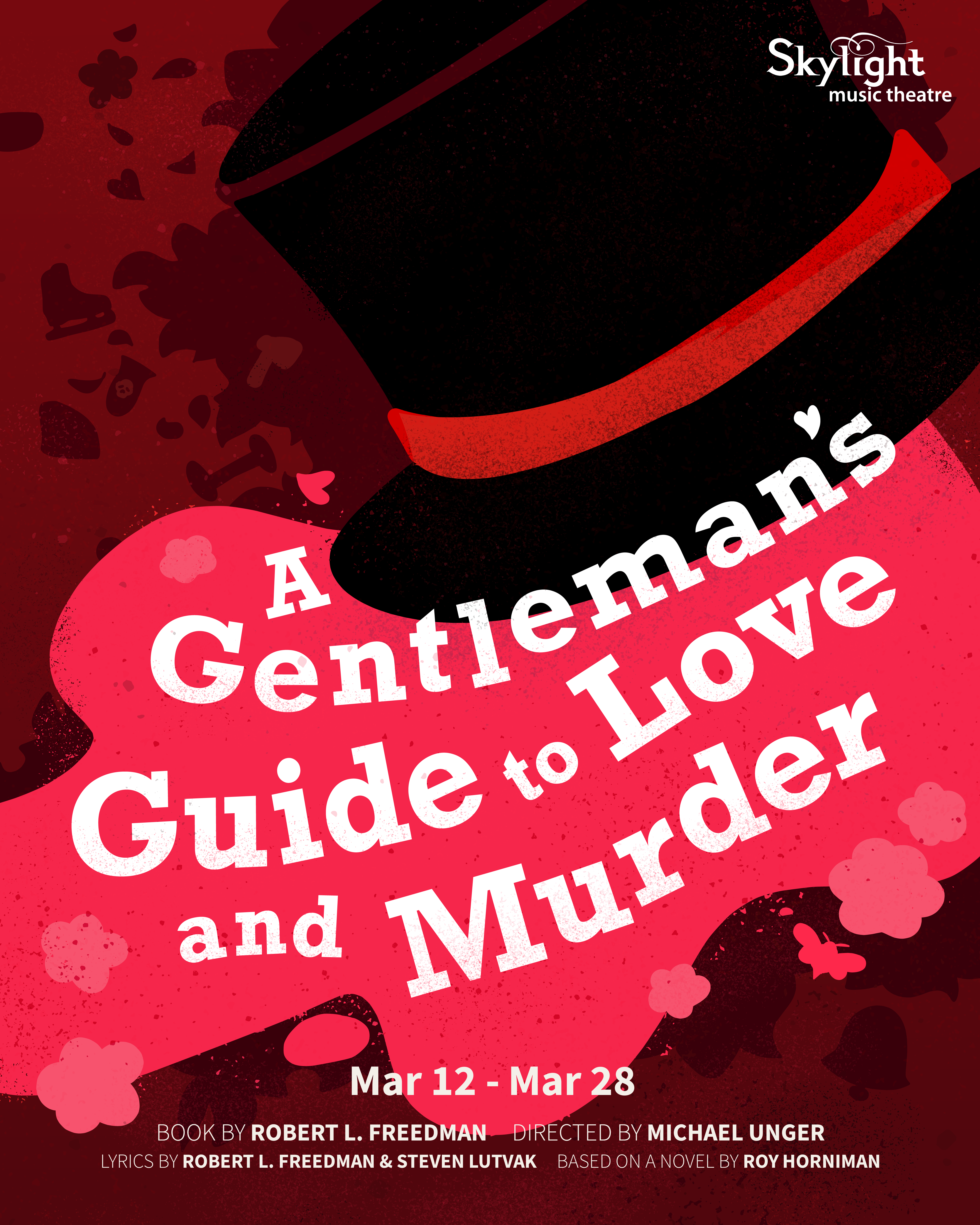
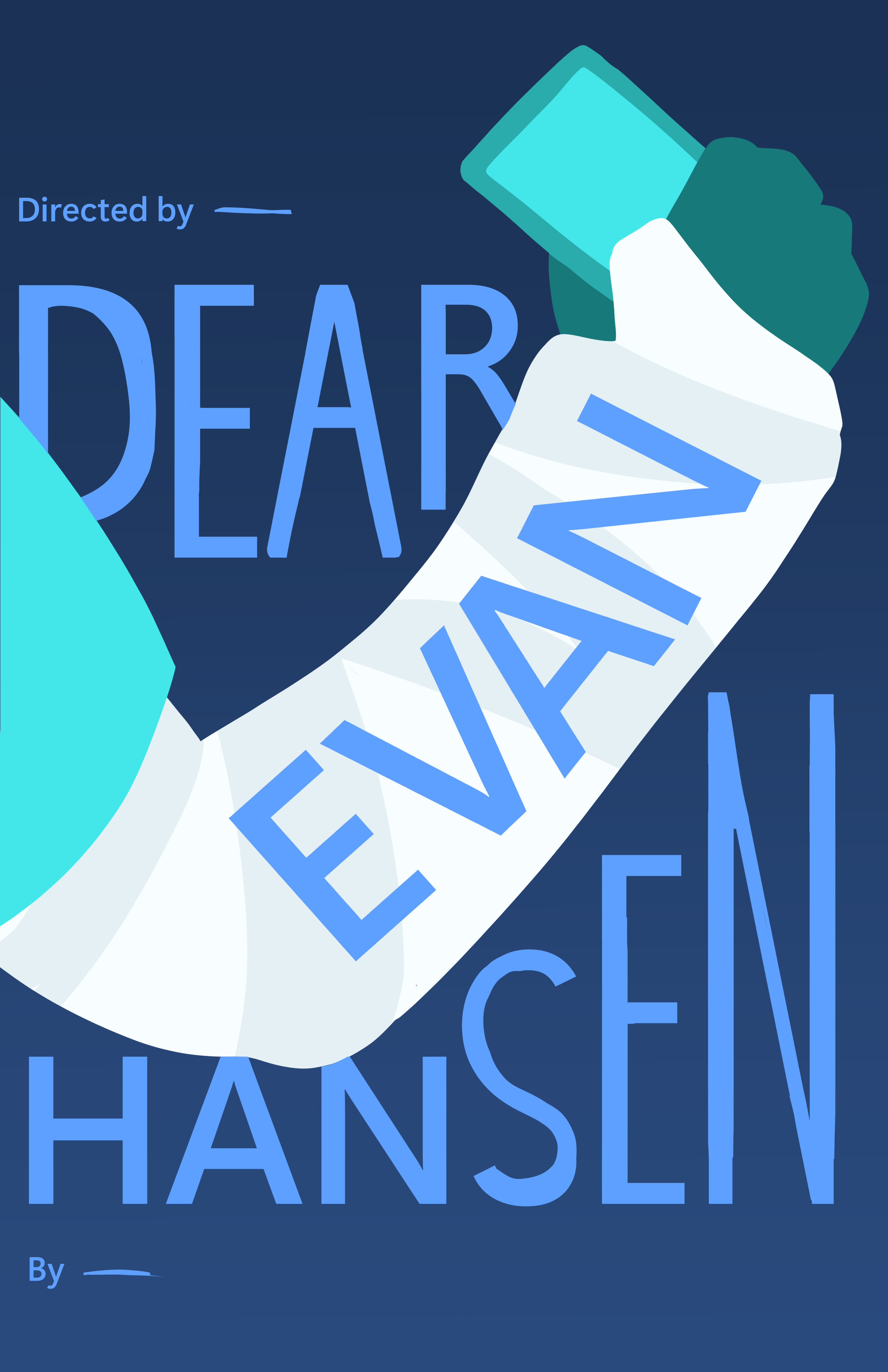
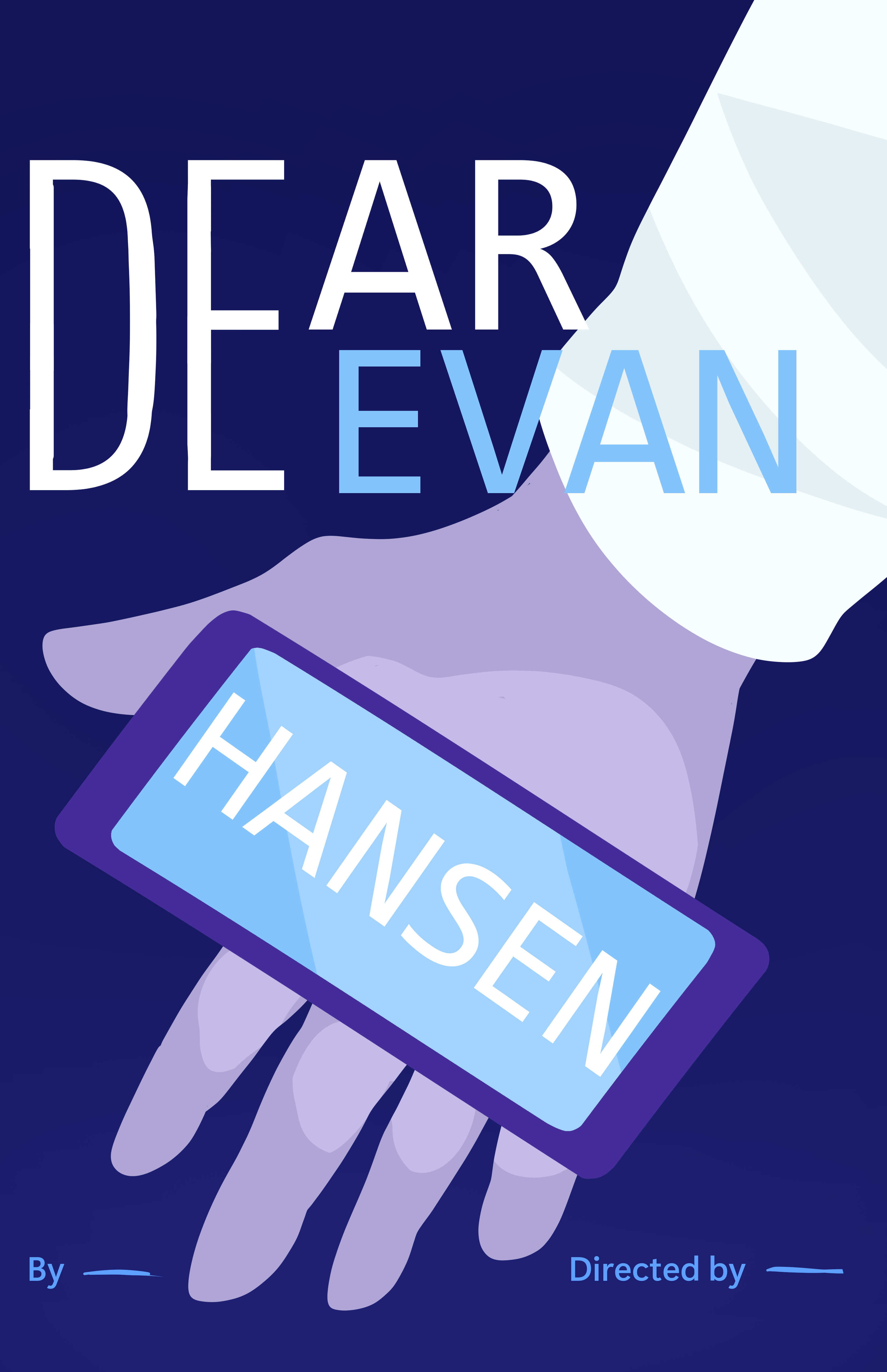
At this point, they requested the posters be moved to a vertical format.
This meant I needed to be flexible and able to rearrange the details of the sketches. I shifted elements of the illustrations and adjusted the typography to better fit the new size.
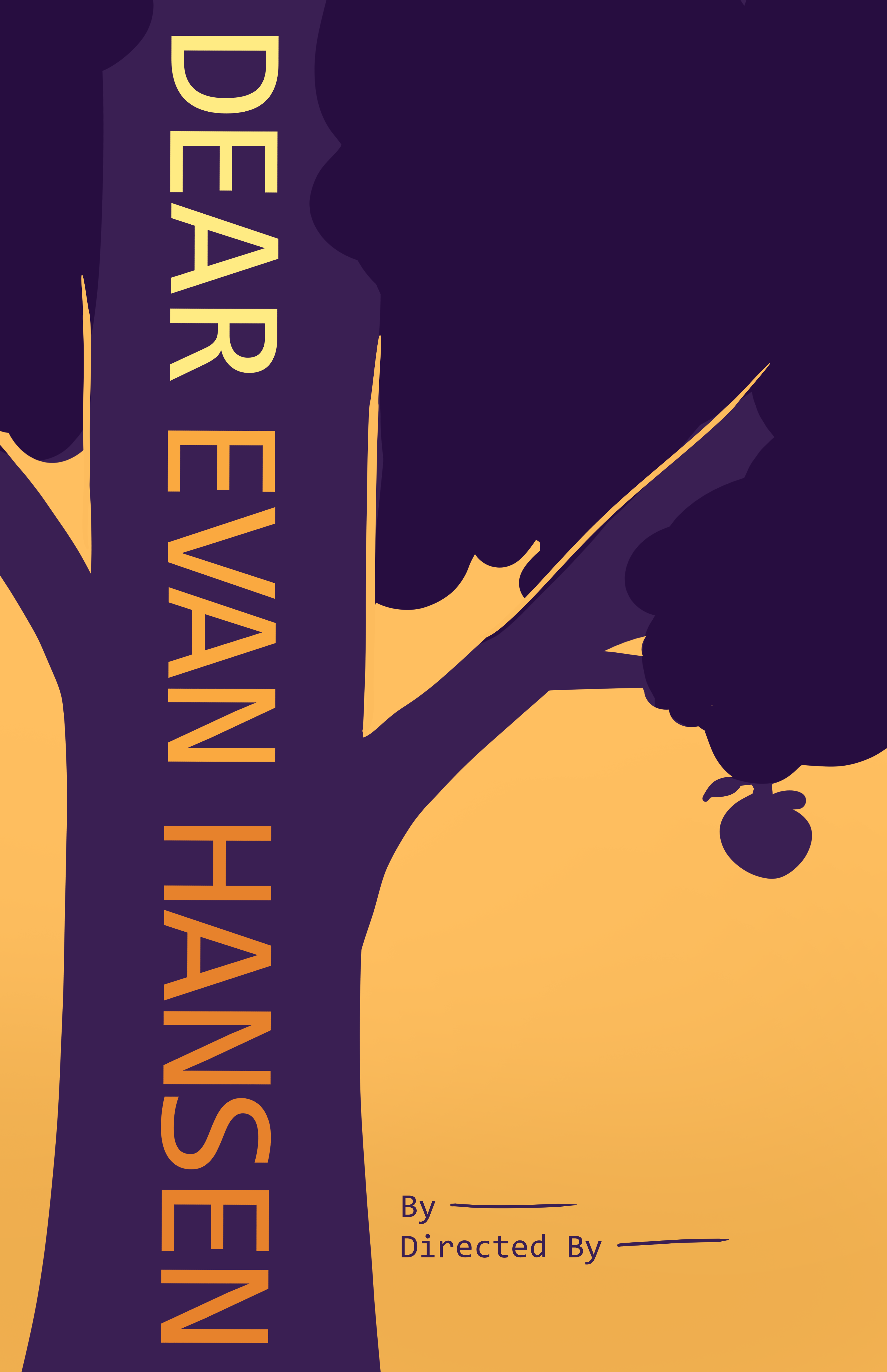
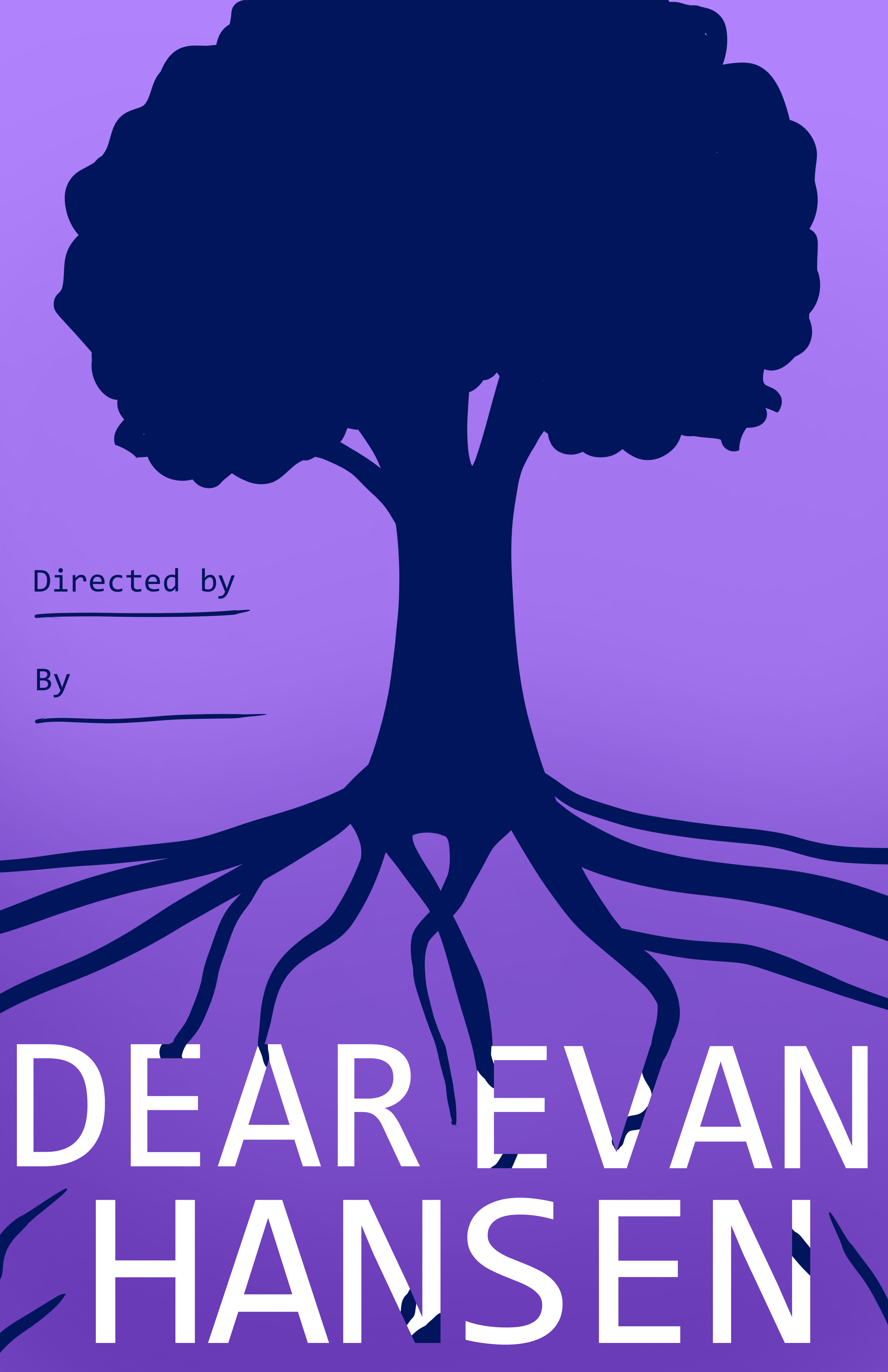
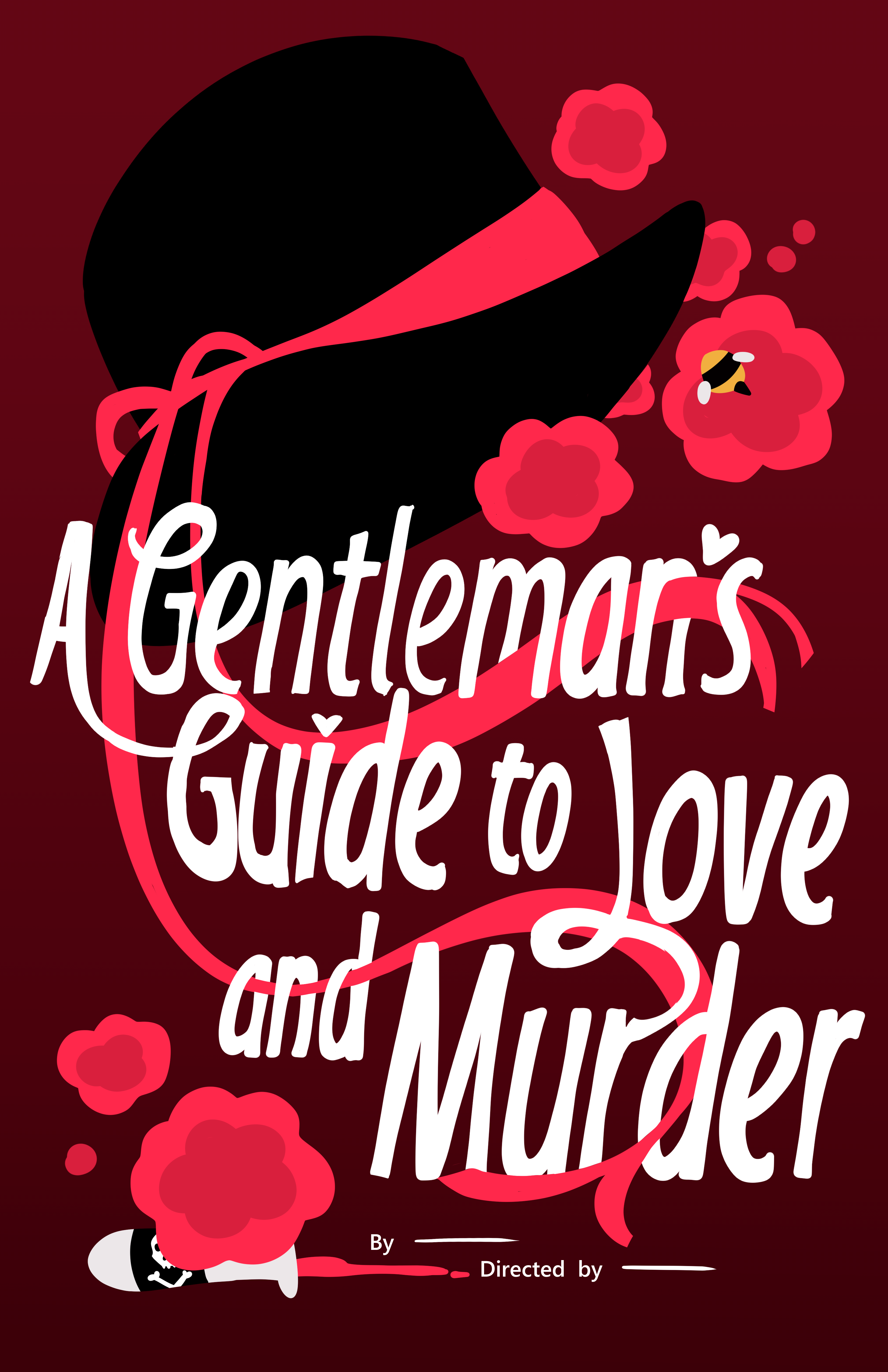
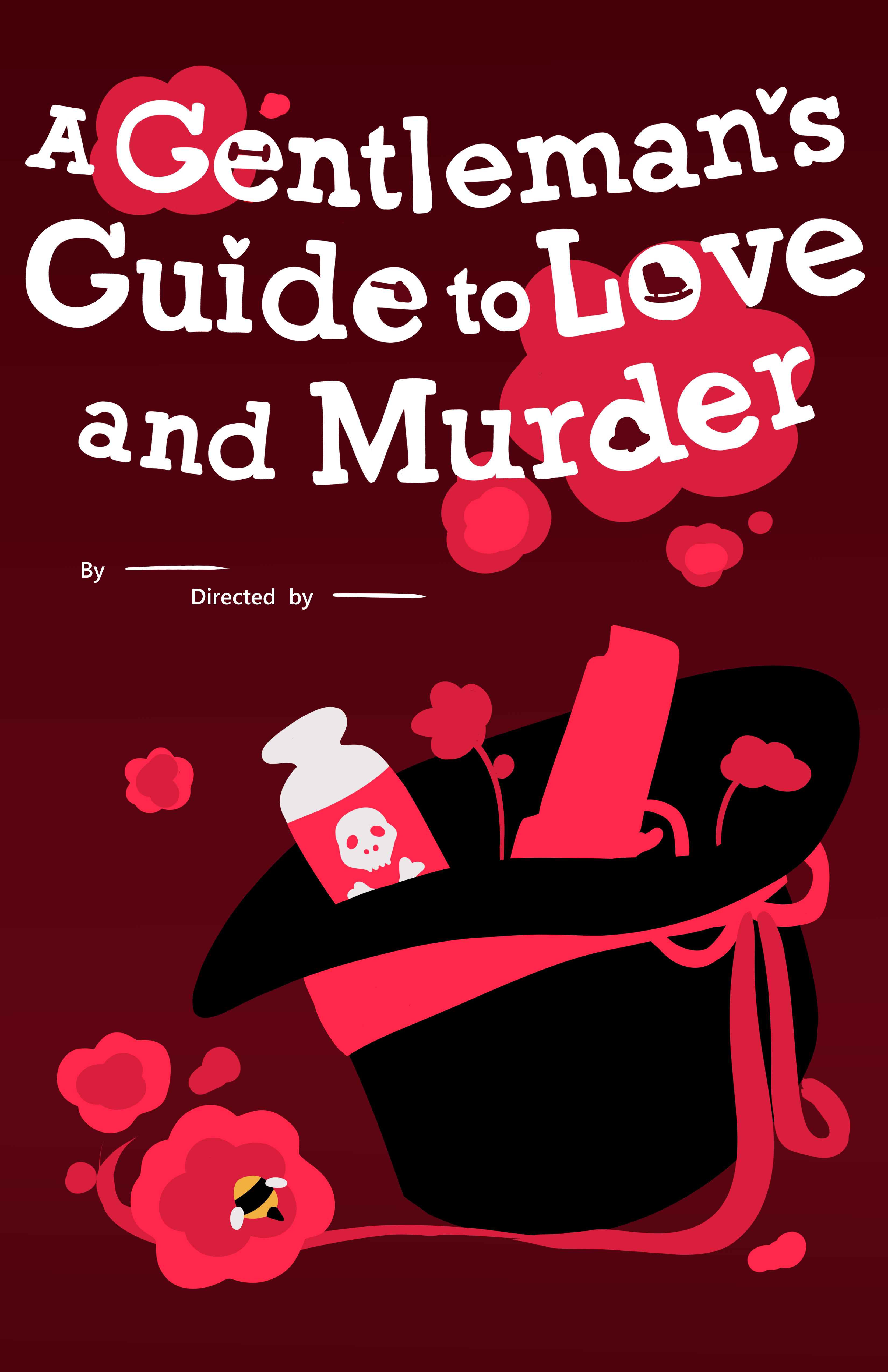
Once these sketches were complete, they chose their preferred options for me to vectorize. They supplied the credits they wanted me to add, and also decided they wanted me to create both a vertical and horizontal version of the poster, with the horizontal one being on a tighter deadline.
My takeaway.
This project taught me a great deal about creating stylistically consistent work in a team. In collaborating with the other designer, I got to incorporate organized file, folder, and layer naming, group planning sessions, and new ways of working with Illustrator brushes.
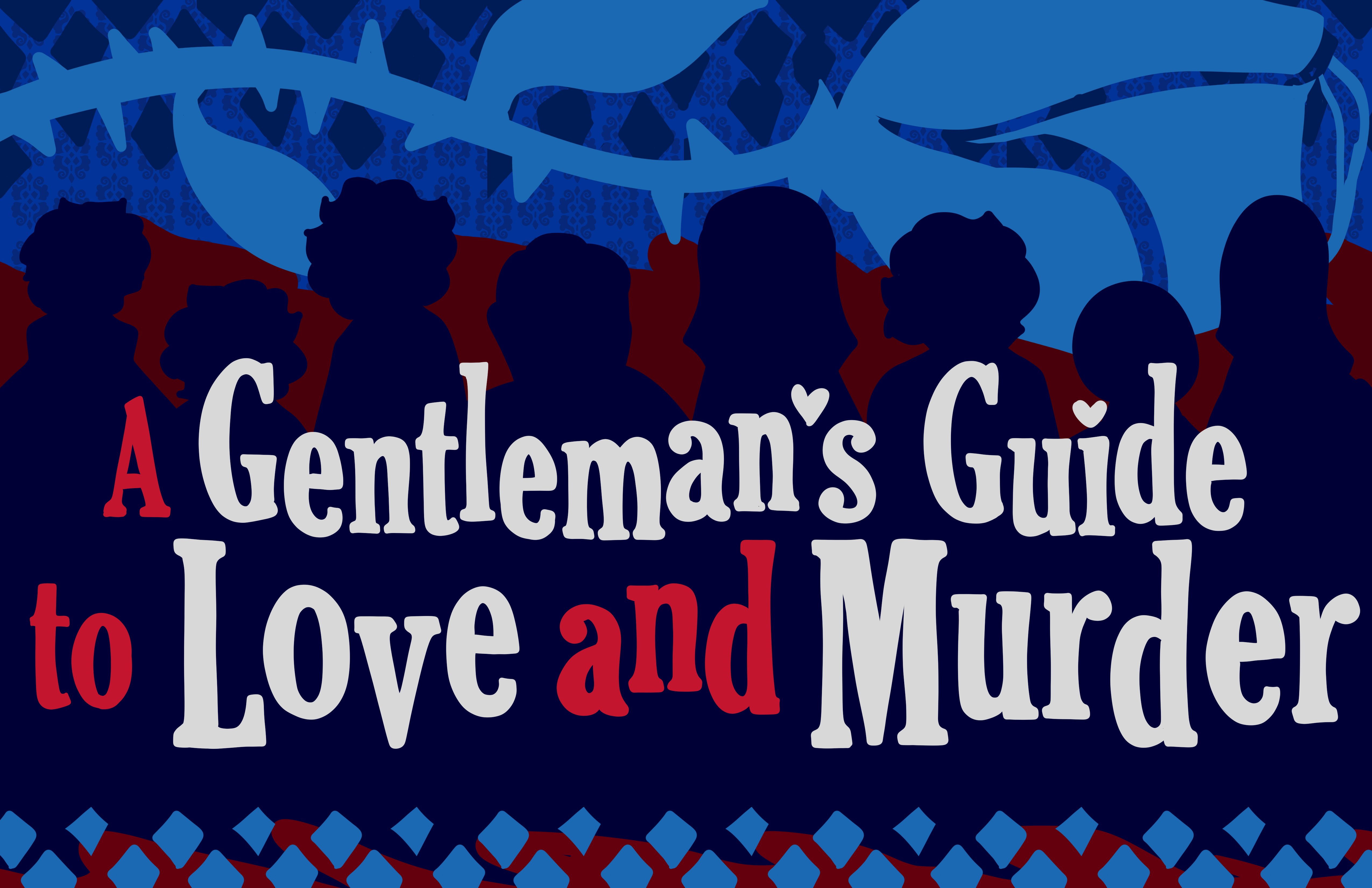
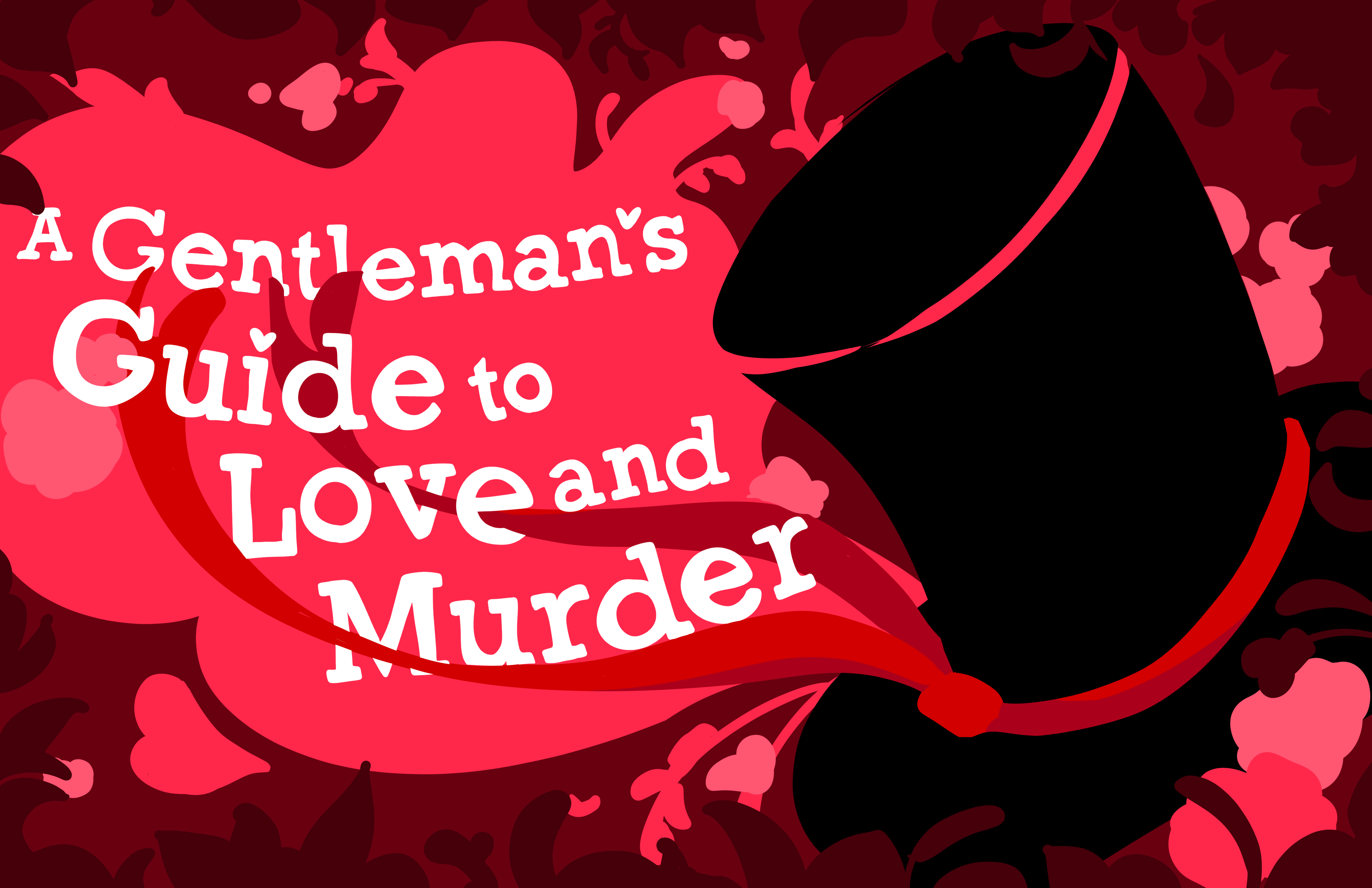
Finishing touches and results.
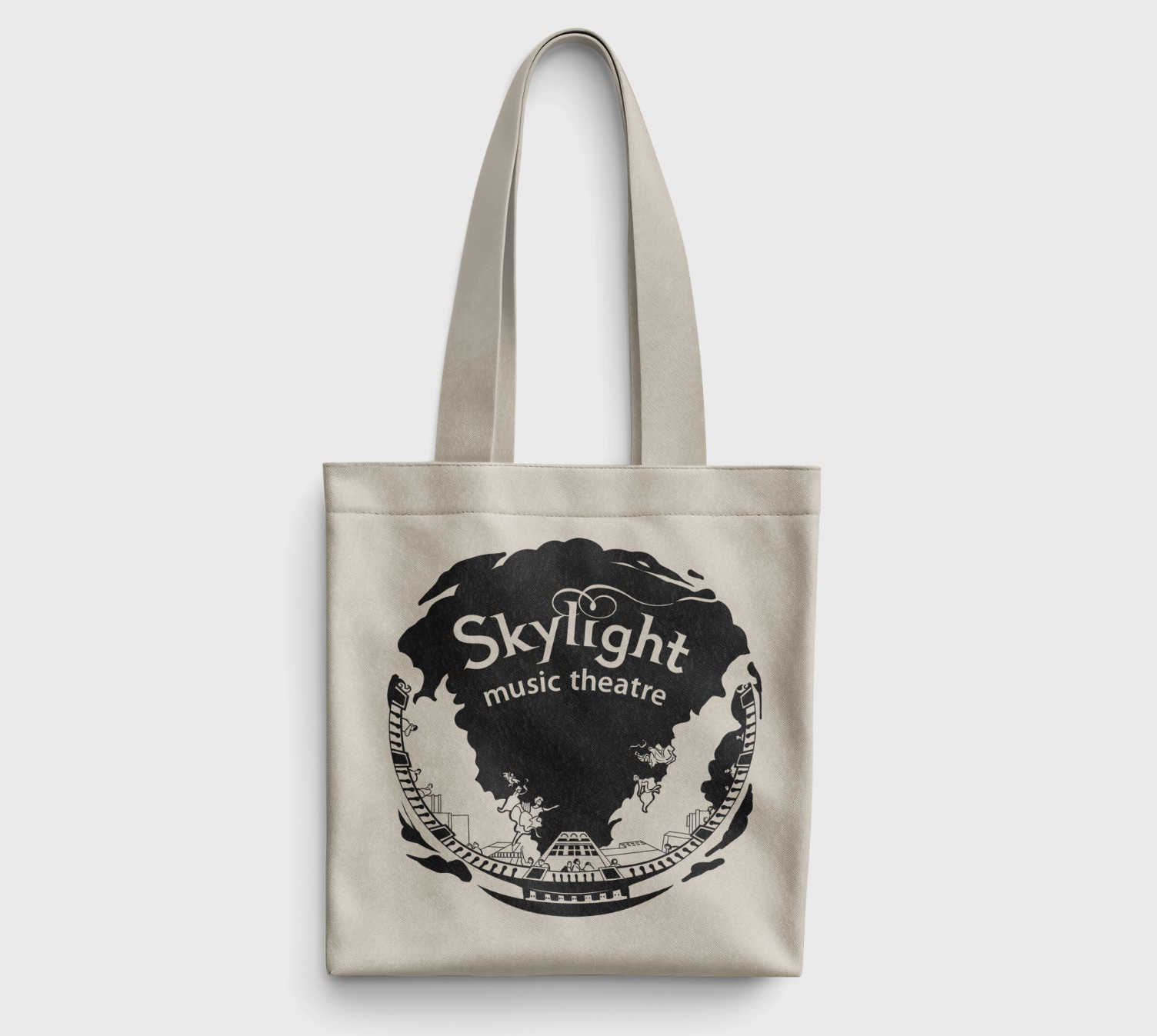
The other designer and I made sure to use the same Illustrator brushes for the textures and color blocking for the shapes. We also shared files to keep the credits typography and logo consistent. Once Skylight had agreed, we sent over the final files and vector images for use as email banners, printed posters, and website graphics.
In the end, our posters were revealed on the WISN channel, as well as in an official program at the Skylight theater. The tote bag I created was handed out as an incentive to subscribe to the theater.